Best Interior Paint Colors for Atlanta Homes
Explore the best interior paint colors for Atlanta homes, from warm whites and greige to soft blues, muted greens, and room-by-room color ideas.
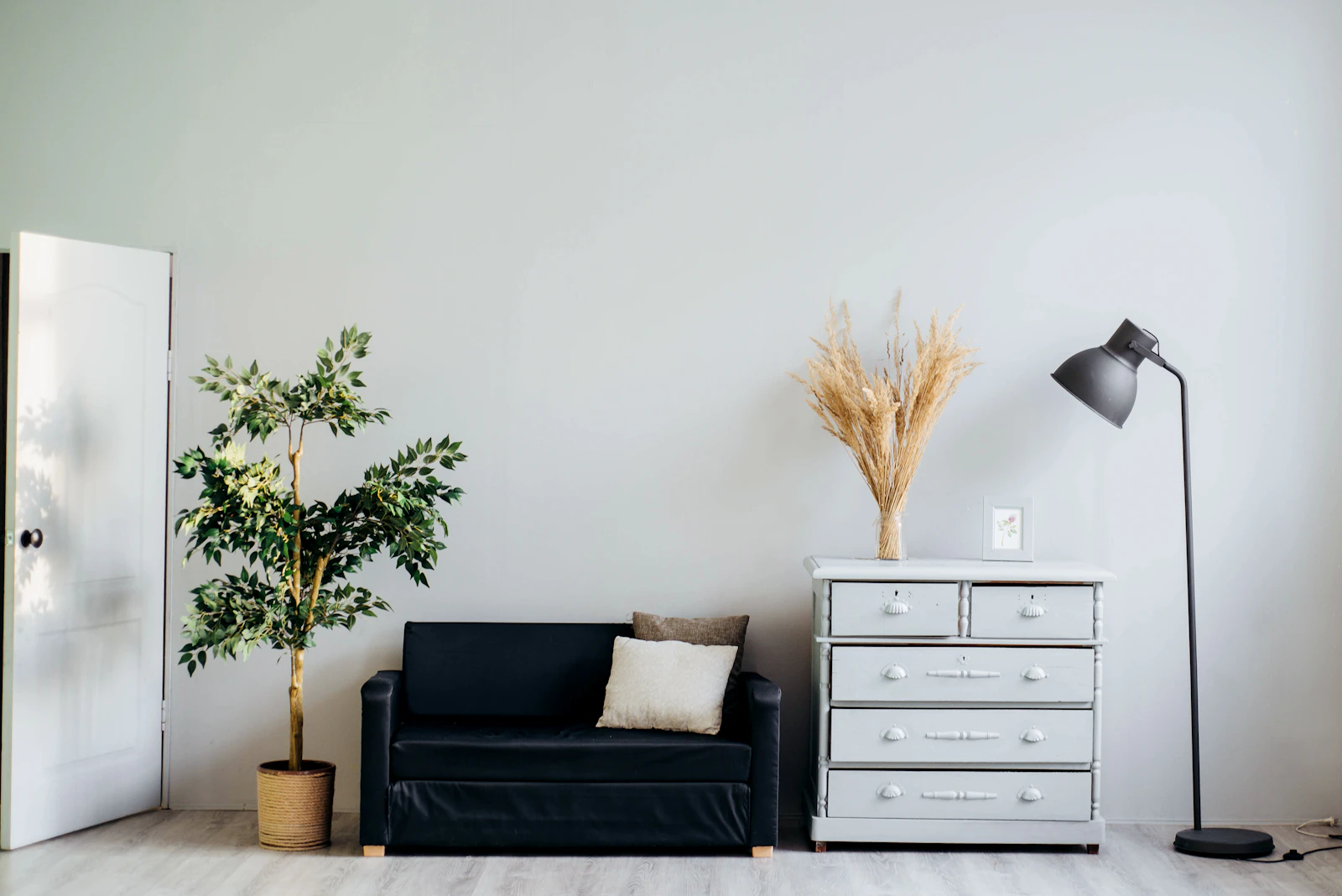
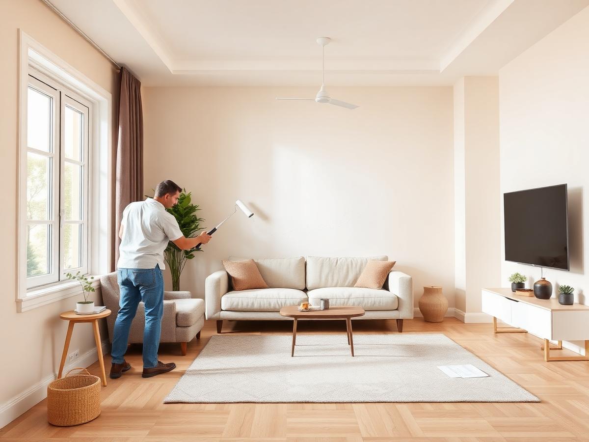
Choosing an interior paint color for an Atlanta home is about more than following a yearly color trend. The best shade needs to work with the room’s natural light, flooring, cabinets, trim, furnishings, and overall architecture. A color that looks soft and balanced in a paint store can appear much warmer, cooler, brighter, or darker once it is on the walls.
Atlanta homes also vary widely. You may be choosing colors for a traditional brick home in Buckhead, a townhome near Midtown, a ranch house in Decatur, or a newer property in the northern suburbs. Each home has different light exposure and fixed finishes.
The most reliable approach is to begin with the features that will stay in place, test large samples on the actual walls, and choose a palette that feels comfortable in morning, afternoon, and evening light. Warm neutrals—including greige, creamy white, beige, and soft earth tones—are currently common choices for Atlanta interiors, but the right shade depends on the individual room.
Start With the Room’s Light
Light is one of the biggest reasons a paint color looks different from one home to another. Before selecting a color, pay attention to the direction of the windows and how sunlight moves through the room.
North-facing rooms
North-facing rooms often receive softer, cooler light. Blue, gray, and green undertones may become more noticeable. If the room already feels cool or shadowed, a warm white, creamy neutral, beige, or warm greige can help create a more comfortable appearance.
South-facing rooms
South-facing rooms generally receive stronger natural light for much of the day. Nearly any color may appear brighter, and warm undertones can become more obvious. Soft gray, balanced greige, muted blue, and pale green can work well when you want to temper the warmth.
East-facing rooms
East-facing rooms receive warmer morning light and may become more subdued later in the day. A versatile neutral can look bright early and softer in the afternoon. Consider colors that do not depend entirely on strong sunlight to look balanced.
West-facing rooms
West-facing rooms often receive intense, warm afternoon light. Cream, beige, and warm tan shades may appear especially golden. If you want to reduce that effect, test a neutral gray, soft blue-gray, or balanced greige before making a final decision.
Artificial lighting matters too. Warm bulbs can make beige and cream appear richer, while cooler bulbs can emphasize blue and gray undertones.
Warm White for Atlanta Interiors
Warm white remains one of the most flexible choices for Atlanta homes. It can brighten a room while avoiding the stark appearance that some pure whites create. A warm white may contain subtle beige, cream, yellow, or soft gray undertones.
Warm white works well for:
- Living rooms.
- Hallways.
- Bedrooms.
- Open-concept spaces.
- Trim and doors.
- Rooms with natural wood flooring.
- Homes with cream, beige, or stone finishes.
A warm white is not automatically the right white. Some shades look yellow beside cool gray flooring, while others may appear pink beside certain brick or upholstery. Compare the sample with the flooring, countertop, cabinets, and window trim before choosing.
Using one warm white throughout connected areas can make a home feel more cohesive. You can create variation through sheen, trim color, furniture, artwork, and accent walls rather than selecting a completely different wall color for every room.
Soft Greige
Greige combines gray and beige. It has become a popular option because it can bridge warm and cool design elements. A well-balanced greige can work with natural wood, white trim, stone, black hardware, stainless steel, and many flooring tones.
Greige is useful when:
- You want a neutral with more depth than white.
- Your home includes both warm and cool finishes.
- You want a color that can continue through an open floor plan.
- You are preparing a property for sale.
- You want a calm background for artwork and furnishings.
Not every greige is neutral. Some lean strongly beige, while others lean blue-gray. Test the color beside your flooring and cabinets. If the sample looks purple, pink, or blue in the room, choose a shade with a different undertone.
Beige and Cream
Beige and cream can create a warm, welcoming atmosphere, particularly in traditional homes or rooms with wood floors and warm furnishings. These colors are especially useful when a bright white would feel too sharp.
Cream may work well on:
- Dining room walls.
- Living room walls.
- Entryways.
- Bedrooms.
- Trim in a warm palette.
- Rooms with natural stone or wood accents.
The main risk is choosing a beige that is too yellow or too dark for the room. Look at the color in both natural and artificial light. A beige that feels soft in daylight may become noticeably golden under warm bulbs.
Pair cream walls with slightly brighter trim for subtle definition. Alternatively, use the same color in different sheens for a quiet, layered effect.
Light Gray
Light gray can give Atlanta interiors a clean, contemporary appearance. It works well with white trim, black fixtures, light oak flooring, modern furniture, and simple window treatments.
Gray should be selected carefully because undertones are easy to notice. A cool gray may appear blue or violet, while a warmer gray may look closer to greige. The amount of natural light also influences the result.
Use light gray when you want:
- A modern neutral background.
- Contrast against bright white trim.
- A clean look with dark hardware.
- A flexible color for bedrooms or offices.
- A connection between cool flooring and warmer furnishings.
If the room has limited daylight, test the gray for several days. Some colors that look fresh in a sunny room can feel heavy or flat in a darker space.
Soft Blue and Blue-Gray
Soft blue can add personality while remaining calm. Blue-gray is often easier to use than a bright blue because it has a muted, more adaptable appearance.
These shades can work well in:
- Bedrooms.
- Bathrooms.
- Home offices.
- Laundry rooms.
- Guest rooms.
- Reading areas.
A blue with a gray or green undertone may pair well with white trim, natural wood, brushed metal, and light neutral fabrics. Strong blue can become intense in bright light, so use a large sample before painting a full wall.
For connected spaces, a soft blue accent room can work with greige or warm white areas nearby. Keep the undertones compatible so the transition feels intentional.
Muted Green
Muted green has become a useful interior choice for homeowners who want color without overwhelming the room. Sage, eucalyptus, olive, and dusty green can connect indoor spaces with Atlanta’s leafy outdoor surroundings.
Muted green may complement:
- Wood floors.
- Brass or bronze hardware.
- Cream trim.
- Natural stone.
- Woven fabrics.
- Darker cabinetry.
- Rooms with garden views.
The right green depends heavily on undertone. A sage with too much blue may feel cool, while an olive with too much yellow can appear muddy. Test it beside the room’s permanent finishes.
Use muted green on all four walls for a comfortable, enveloping effect, or use it on one wall to create a controlled accent.
Earth Tones
Soft clay, terracotta, mushroom, caramel, and muted brown can add warmth and depth to Atlanta interiors. These colors work especially well when the home includes natural materials or a relaxed, organic design style.
Earth tones can be effective in:
- Dining rooms.
- Studies.
- Bedrooms.
- Hearth rooms.
- Accent walls.
- Rooms with leather, wood, or woven furniture.
Because deeper earth tones absorb more light, they can make a room feel smaller or cozier. That may be desirable in a dining room or study, but less suitable for a small hallway.
Balance a deeper color with lighter trim, ceiling paint, reflective surfaces, or adequate lighting.
Accent Walls and Feature Areas
An accent wall can create visual interest without requiring a strong color throughout the entire room. Good locations may include:
- The wall behind a bed.
- A fireplace wall.
- The wall behind a desk.
- A dining room feature wall.
- A recessed area.
- The back wall of built-in shelving.
Choose an accent color that relates to something already in the room. It can repeat a color from a rug, artwork, upholstery, tile, or decorative object.
Avoid choosing an accent wall simply because it is the most visible wall. Consider how the color will look from nearby rooms and hallways.
Kitchen Paint Colors
Kitchen colors should be selected alongside the cabinets, countertops, backsplash, flooring, and appliances. The same wall color can appear different beside white cabinets than beside natural wood or dark cabinetry.
Popular kitchen directions include:
- Warm white with natural wood.
- Soft greige with white cabinets.
- Light gray with dark hardware.
- Muted green with brass accents.
- Cream with warm stone.
- Blue-gray with white or pale cabinets.
If the kitchen opens into the living room, coordinate the two spaces rather than treating them as unrelated rooms. The colors do not need to match, but their undertones should work together.
Bathroom Paint Colors
Bathrooms need paint suitable for the room’s moisture conditions and ventilation. Color selection should also account for tile, vanity finishes, mirrors, and lighting.
Soft white, pale gray, muted blue, sage, and light greige can all work well. Darker colors may create a dramatic appearance but should be tested carefully in small bathrooms.
Do not use paint color to compensate for ongoing moisture problems. Leaks, condensation, poor ventilation, or mildew should be addressed before painting.
Bedrooms and Restful Colors
Bedrooms often benefit from colors that feel calm rather than highly energetic. Warm white, soft beige, dusty blue, muted green, light lavender-gray, and gentle greige can create a comfortable backdrop.
Consider the room’s purpose. A bright color may suit a child’s room or creative space, while a softer palette may work better for a primary bedroom or guest room.
Sample the color behind the headboard and on a wall near the window. Fabrics and lamps can change how the shade appears after the room is furnished.
Trim, Doors, and Ceilings
Trim does not always have to be bright white. It can be:
- A softer version of the wall color.
- Warm white.
- Cream.
- Light greige.
- A deeper contrasting neutral.
- The same color as the wall in a different sheen.
Painting trim the same color as the walls can create a more seamless, contemporary appearance. A contrasting trim color can highlight windows, baseboards, doors, and architectural details.
Ceilings are often painted a light neutral, but they do not have to be pure white. A warm white or very pale version of the wall color can create a softer transition.
Test Paint the Right Way
Never choose an interior color from a small paper chip alone. Paint a large sample on the actual wall or use a large sample board placed near the room’s fixed finishes.
For better results:
- 1Apply two coats of the sample.
- 2Test more than one wall when possible.
- 3Check the color in morning light.
- 4Check it in afternoon light.
- 5View it under evening lighting.
- 6Place it near flooring, cabinets, and trim.
- 7Leave it in place for at least a day or two.
- 8Compare warm and cool options side by side.
A color sample can look different depending on what surrounds it. Do not evaluate it against a bright white sheet of paper only.
Build a Whole-Home Palette
A whole-home palette does not require every wall to be the same color. Instead, choose a small group of related colors.
For example:
- Main areas: warm white or light greige.
- Bedrooms: soft blue or muted green.
- Office: medium greige or earth tone.
- Trim: warm white.
- Doors: charcoal, navy, or natural wood.
- Ceilings: lighter version of the main neutral.
Repeat colors through hallways, furniture, artwork, and accessories. This creates continuity even when individual rooms have different personalities.
When to Hire a Professional Painter
A professional painter can help identify surface problems, recommend suitable products, explain sheen options, and prepare the walls for a consistent finish. Careful preparation is particularly important when changing from a dark color to a light color or when walls have visible repairs, stains, texture, or heavy wear.
Dunwoody Painters provides interior painting services for homes and businesses throughout the Atlanta area. Contact the team for a free estimate and discuss your rooms, color ideas, preparation needs, and project schedule.
Final Thoughts
The best interior paint color for an Atlanta home is the one that works with the actual room—not simply the shade that is trending online. Begin with natural light and permanent finishes, compare undertones, test generous samples, and consider how connected rooms will look together.
Warm whites, greiges, soft grays, muted greens, gentle blues, and natural earth tones all offer flexible options. The final result depends on the color, the surface preparation, the lighting, the finish, and the quality of the application.
Ready to refresh your Atlanta home? Contact Dunwoody Painters for a free interior painting estimate.
Common questions
Frequently Asked Questions
Keep reading
Best Exterior Paint Colors for Sandy Springs Homes
Choosing an exterior paint color for a Sandy Springs home involves more than picking a shade you like. Explore practical color ideas for siding, brick, trim, shutters, and front doors, plus tips for testing colors in Georgia’s changing light.

How to Choose the Right Painting Contractor in Georgia
Learn how to choose a reliable painting contractor in Georgia by comparing estimates, checking insurance, reviewing preparation plans, and reading the contract carefully.

How Georgia's climate affects exterior house painting
A new coat of paint can protect and improve an exterior, but it works best when it is applied to a properly prepared and appropriately dry surface.