Best Interior Paint Colors for Georgia Homes in 2026
Explore paint colors for Georgia homes in 2026, including named whites, neutrals, greens, and deeper accents, plus room-by-room ideas and practical sampling tips.
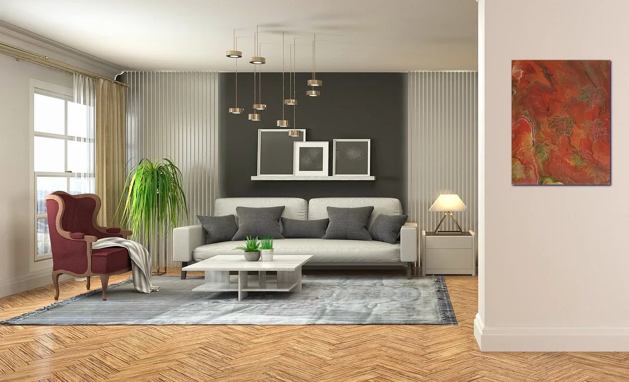
The best interior paint colors for Georgia homes are the ones that work with the house you already have: its windows, flooring, trim, cabinets, furniture, and the way you use each room. For 2026, warm whites, earthy neutrals, muted greens, and thoughtfully placed dark accents offer useful starting points—but a trending shade is not automatically the right choice for your walls.
A living room shaded by mature trees in Dunwoody may need a different palette from a bright Atlanta condo. A traditional Sandy Springs home with honey-toned hardwood floors presents different choices from a renovated Roswell kitchen with cool stone countertops. Location provides context, but the room’s actual light and materials should guide the decision.
This guide combines current color inspiration with practical ways to select a whole-home palette. You will find named paint shades, manufacturer codes, suggested combinations, room recommendations, and a sampling process that can help you avoid an expensive color mistake.
If you are planning a repaint, Dunwoody Painters’ professional interior painting services can help you coordinate surface preparation, products, sheens, and scheduling with your chosen colors.
What Interior Paint Colors Are Trending in 2026?
Warmth and depth are useful themes to explore this year. Benjamin Moore’s official 2026 palette includes Swiss Coffee OC-45, Raindance 1572, Sherwood Tan 1054, Southwest Pottery 048, Narragansett Green HC-157, and Silhouette AF-655 a mix of lighter neutrals, earthy shades, and richer colors.
That palette is inspiration, not evidence that one color is the most popular choice across Georgia. There is no verified statewide homeowner-preference ranking behind the recommendations in this article.
Warm Whites and Creams
Warm whites can create a light background without the sharper contrast of a very crisp white. Consider them when your home includes warm wood floors, cream upholstery, beige stone, or brass finishes.
The important distinction is undertone. A white that looks balanced beside one countertop may look yellow beside another. Choose it alongside your permanent finishes, not from a screen alone.
Warm Greiges and Earthy Neutrals
Greige, beige, mushroom, and soft tan are worth testing when you want more depth than white without committing to a strong color. They can form a practical foundation for connected living areas.
Treat these as color families rather than interchangeable shades. Two similar neutrals may react differently beside red-toned hardwood, gray tile, or cream cabinetry.
Muted Greens
Green can introduce color while maintaining a restrained appearance. Sherwin-Williams describes Evergreen Fog SW 9130 as a gentle green, and its suggested coordinating colors include Shoji White SW 7042, Accessible Beige SW 7036, and Urbane Bronze SW 7048.
That makes it a useful candidate for homeowners exploring a natural-looking palette—not a guarantee that it will suit every room.
Rich Accent Colors
Deep green, brown, navy, and charcoal can give a study, dining room, or powder room a more enveloping character. You do not need to paint the entire home dark to use them effectively.
A single room, fireplace wall, or set of built-ins can introduce contrast while keeping the main living areas lighter.
The Best Interior Paint Colors for Georgia Homes
The following shades are a shortlist to sample, not a universal ranking. Suggested room uses and combinations are design recommendations; confirm them in your own lighting before purchasing paint.
Best Warm White Paint Colors
Sherwin-Williams Alabaster : SW 7008
Alabaster is a balanced white in Sherwin-Williams’ official collection. Consider it for living areas, bedrooms, and connected spaces where you want a softer white backdrop.
Suggested palette:
- Walls: Alabaster.
- Accents: muted green or warm brown.
- Furnishings: natural wood and textured neutral fabrics.
If you plan to use Alabaster on walls and trim, compare the proposed sheens together. Different levels of reflection can change how the same color appears.
Benjamin Moore White Dove - OC-17
Benjamin Moore identifies White Dove as a clean, classic white. It is a useful starting point for walls, trim, or ceilings when you want to compare a softer white against your existing finishes.
Try a sample beside cream cabinets, stone, and flooring. Do not assume that two “white” surfaces will coordinate simply because both appear neutral separately.
Benjamin Moore Swiss Coffee - OC-45
Swiss Coffee appears in Benjamin Moore’s 2026 color palette and is also recommended by the manufacturer as an off-white to consider across different exposures.
Consider it for a warm, cohesive main-floor palette. Compare it directly with other whites to see whether its character suits your cabinets and trim.
Best Neutral Paint Colors for Open-Plan Homes
Sherwin-Williams Accessible Beige SW 7036
Accessible Beige is an established neutral in Sherwin-Williams’ collection. It is worth sampling when you want a warmer alternative to a cool gray.
Suggested uses include living rooms, hallways, and dining areas. Pairing candidates include a soft white trim and a muted green adjoining room; Sherwin-Williams includes Accessible Beige in its coordinating palette for Evergreen Fog.
Benjamin Moore Sherwood Tan — 1054
Sherwood Tan is part of Benjamin Moore’s official 2026 palette. Consider it when a pale neutral feels too slight and you want a warmer, more substantial background.
Test it beside wood floors and large upholstered pieces. In an open-plan home, check the sample from the kitchen, dining area, and hallway—not only from the center of the living room.
Best Green Paint Colors for a Natural Look
Sherwin-Williams Evergreen Fog — SW 9130
Evergreen Fog is a gentle green-gray that can serve as a restrained alternative to beige or gray. Sherwin-Williams recommends combinations with Shoji White, Accessible Beige, and Urbane Bronze.
Possible uses include bedrooms, home offices, dining rooms, and selected built-ins. If you like it in daylight but not under your lamps, review the lighting before rejecting or committing to the color.
Benjamin Moore Narragansett Green — HC-157
Narragansett Green is a deeper option in Benjamin Moore’s 2026 palette. Consider it for a study, dining room, or small room where you deliberately want a richer atmosphere.
A light ceiling, natural wood furniture, and a restrained trim color are useful pairing ideas to test. Deep colors should be evaluated across a generous sample area rather than a tiny swatch.
Best Blue and Dark Accent Colors
Benjamin Moore Raindance - 1572
Raindance is included in Benjamin Moore’s 2026 palette and offers another direction to explore alongside the collection’s warm neutrals and deeper shades.
Consider it as a sample candidate for a bedroom, bathroom, or office. Place it next to tile, fabrics, and cabinetry before deciding whether its undertones suit the room.
Sherwin-Williams Urbane Bronze — SW 7048
Urbane Bronze appears in Sherwin-Williams’ suggested palette with Evergreen Fog and Accessible Beige. It can provide a deeper contrast within that coordinated scheme.
Possible applications include a fireplace wall, study, interior doors, or built-ins. Choose where the darker color will stop and how it will look from neighboring rooms before painting.
Benjamin Moore Silhouette — AF-655
Silhouette belongs to Benjamin Moore’s 2026 palette. It is worth exploring when you prefer a rich accent to a bright or strongly saturated color.
Try it in a dining room or powder room, or compare it against a lighter main-floor neutral. The goal is deliberate contrast, not a collection of unrelated colors.
How Natural Light Affects Interior Paint Colors
“Georgia light” is not one consistent condition. Window direction, tree cover, nearby buildings, porch depth, and the time of day can all affect a room. Evaluate the actual space rather than assuming every home needs a warm paint color.
North-Facing Rooms
Benjamin Moore notes that northern exposure tends to provide consistent but muted light, which can give colors a cooler appearance. The manufacturer recommends considering warm undertones when you want to counterbalance that effect.
Start by comparing a warm white, a light warm neutral, and one deeper option. A pale color will not create daylight where little exists, and a darker room does not always need to be painted white.
South-Facing Rooms
Rooms with stronger daylight give you more flexibility, but you should still test samples throughout the day. Benjamin Moore emphasizes that exposure influences a color’s intensity and cast.
Compare whether a warm shade becomes too creamy or whether a cooler shade stays balanced. The answer depends on the room, not a universal rule.
Tree Cover and Surrounding Materials
In a shaded room, move sample boards close to the windows and then to the interior walls. Check them beside flooring, stone, curtains, and furniture.
If a color seems unsuitable in only one part of the room, investigate what surrounds it. The sample may be reflecting or contrasting with a nearby finish rather than simply being the “wrong” color.
LED Lighting
Review paint samples under the lights you normally use at night. Benjamin Moore recommends observing colors under both natural and artificial lighting before making a final selection.
If you are replacing light bulbs or fixtures, settle those changes before approving the paint. Otherwise, you may choose a color under lighting that will not remain in the room.
The Best Interior Paint Colors for Each Room
Living Rooms
Begin with the largest elements: flooring, sofa, rug, fireplace, and window treatments. Alabaster, White Dove, Accessible Beige, or another carefully sampled neutral can provide a flexible background.
If the living room opens into the kitchen, assess both spaces together. A wall color should complement the cabinets as well as the furniture.
Kitchens and Dining Rooms
Kitchen wall colors need to work with cabinetry, countertops, backsplash, and appliances. Warm white may suit one combination, while greige or muted green may suit another.
If cabinets are also being updated, review kitchen cabinet paint color ideas before finalizing the walls. Your existing cabinet guide includes whites, warm neutrals, greens, and darker accent options.
Dining rooms offer more freedom for deeper colors, particularly if you want a distinct evening atmosphere. Test the color under the dining fixture, not only beside a window.
Bedrooms
Choose a color you enjoy with the bedding, curtains, and lamps you will keep. Warm whites, muted greens, and restrained blue-toned shades are useful candidates.
Evaluate the sample from the bed and near the doorway. A bedroom palette should also feel comfortable when viewed from the hallway.
Bathrooms and Powder Rooms
Use tile, vanity color, and countertop material as the starting point. A small powder room can support a deliberate dark palette, while a shared bathroom may call for a lighter scheme.
Color and coating performance are separate decisions. Discuss the appropriate paint product, surface preparation, and ventilation conditions with your painter.
Home Offices
Choose according to how you use the room. A neutral background may suit frequent video calls, while a muted green or deeper shade can make a separate office feel more distinct.
Check the wall behind your desk on camera before committing. The color should work for both everyday use and the room’s practical requirements.
Choosing Colors for Different Georgia Home Styles
Traditional Homes and Brick Features
Let existing brick, stone, wood, and architectural trim guide the palette. Soft whites and warm neutrals are useful starting points, but test them against the masonry.
Do not choose a wall color in isolation and then try to make the permanent finishes fit afterward.
Modern and Transitional Homes
A limited palette can support cleaner lines. Consider one main neutral, one secondary room color, and one deeper accent.
Contrast does not have to mean black and white. A warm white with muted green or a beige with a richer brown can create definition without sharp transitions.
Older Homes With Wood Trim
Keep the wood’s undertone in mind. Red, orange, and honey-colored woods each interact differently with nearby paint.
If the trim will remain unpainted, place every sample directly beside it. If it will be painted, evaluate the proposed wall and trim colors together before approving either.
For additional local examples, explore our shorter guide to interior paint colors for Atlanta homes.
How to Test Interior Paint Colors Before Painting
Sampling is the most useful step between inspiration and a final decision. Sherwin-Williams offers color chips, peel-and-stick samples, and brush-on samples; Benjamin Moore also recommends movable sample boards for assessing different lighting conditions.
Use this process:
- 1Narrow the choice to two or three candidates.
- 2Prepare large sample boards according to the sample product’s instructions.
- 3Apply enough coats to show the color consistently.
- 4Place each board beside flooring, trim, cabinetry, and furniture.
- 5Move it between sunny and shaded walls.
- 6Review it in the morning, afternoon, and evening.
- 7Compare the complete palette, not just individual shades.
- 8Record the final manufacturer, color name, code, product, and sheen.
You can also visualize paint colors in your room to narrow your options. Dunwoody Painters’ tool accepts room photos, but its digital previews are approximations and should be followed by physical sampling.
If several shades still look close, a professional paint color consultation can help. Dunwoody Painters describes an on-site process using large sample boards alongside flooring, cabinetry, and the home’s lighting.
Ready to Refresh Your Georgia Home?
A useful palette should fit your home today—not simply follow a forecast. Begin with the finishes that will stay, test a small shortlist, and confirm colors and sheens before the painting work begins.
Dunwoody Painters serves homeowners in Dunwoody and surrounding Metro Atlanta communities, including Sandy Springs, Roswell, Alpharetta, and Atlanta. The company’s interior painting service includes discussion of preparation, repairs, products, and finishes before scheduling.
Need Help Choosing a Color?
Work with interior painters in Dunwoody, GA to turn your selected palette into a clearly defined project. Call (678) 737-6776 to request a free interior painting estimate and discuss the rooms you want to refresh.
Common questions
Frequently Asked Questions
Related painting articles
More helpful painting guides

How to Choose the Right Painting Contractor in Georgia
Learn how to choose a reliable painting contractor in Georgia by comparing estimates, checking insurance, reviewing preparation plans, and reading the contract carefully.

How Much Does It Cost to Paint a House in Atlanta in 2026?
Discover 2026 Atlanta whole-house painting costs, including interior and exterior price ranges, per-square-foot estimates, and the factors that affect your final budget.
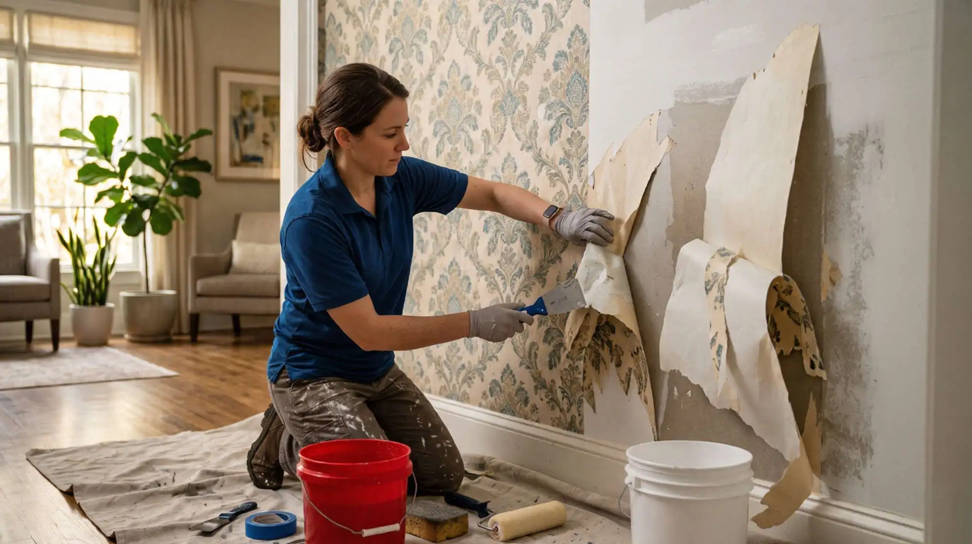
Wallpaper Removal Guide: What Atlanta Homeowners Should Know Before Painting
Learn how Atlanta homeowners can safely remove wallpaper before painting, prepare walls for a smooth finish, avoid common mistakes, and know when professional wallpaper removal is the better option.